Meescan
Meescan
Meescan
MEESCAN
2024
Role
UX Designer (Intern)
UX Designer (Intern)
Timeline
1yr to beta
1yr to beta
Team
5 people
5 people
OVERVIEW
OVERVIEW
Self-checkout for libraries.
Self-checkout for libraries.
Self-checkout for libraries.
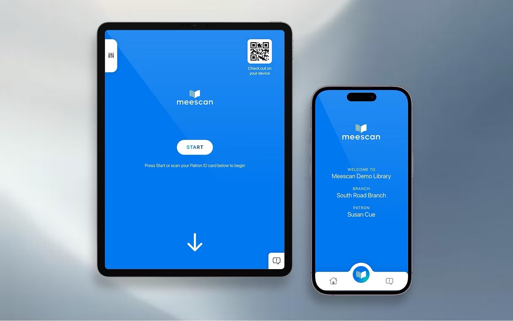
Meescan is a self-checkout solution for libraries, allowing patrons to complete the checkout process from their personal device or using a Meescan kiosk.
The current Meescan app is undergoing a redesign to introduce new features, updated branding, and improved accessibility. My goal was to create a familiar user experience for patrons that encompasses the company's new identity and tone.
Meescan is a self-checkout solution for libraries, allowing patrons to complete the checkout process from their personal device or using a Meescan kiosk.
The current Meescan app is undergoing a redesign to introduce new features, updated branding, and improved accessibility. My goal was to create a familiar user experience for patrons that encompasses the company’s new identity and tone.
THE IMPACT
THE IMPACT
Thoughtfully redesigned.
Thoughtfully redesigned.
Thoughtfully redesigned.
From the way patrons navigate the checkout process to the flexibility staff need behind the scenes, every aspect of the experience was intentionally redesigned to feel more intuitive, transparent, and trustworthy.
While the visual identity and user flows have evolved, the core functionality that library staff and patrons rely on remains fully intact. A modernized interface and clearer interactions reinforce confidence at every step, helping establish greater trust with libraries and consortia while making the platform more approachable for everyday users. Built on the existing foundation, the new experience also introduces greater flexibility, creating opportunities for future integrations, expanded capabilities, and continued innovation.
From the way patrons navigate the checkout process to the flexibility staff need behind the scenes, every aspect of the experience was intentionally redesigned to feel more intuitive, transparent, and trustworthy.
While the visual identity and user flows have evolved, the core functionality that library staff and patrons rely on remains fully intact. A modernized interface and clearer interactions reinforce confidence at every step, helping establish greater trust with libraries and consortia while making the platform more approachable for everyday users. Built on the existing foundation, the new experience also introduces greater flexibility, creating opportunities for future integrations, expanded capabilities, and continued innovation.
5 → 2
5 → 2
Steps to complete checkout
1.8x
1.8x
Checkout completion rate
32%
32%
Fewer support tickets
The old vs. new Meescan experience.

THE PROBLEM
THE PROBLEM
The old app was outdated and needed restructuring.
The old app was outdated and needed restructuring.
The old app was outdated and needed restructuring.
When I joined the company as an intern, the app development team was in the process of redesigning the platform's old interface. However, without a dedicated designer on board, design decisions were being made ad hoc alongside development.
Recognizing this gap, I took initiative and approached the CTO to propose joining the team as a UX designer. Once on the team, I revisited the ideation phrase to redesign and restructure the interface, putting user needs at the forefront of the development process.
When I joined the company as an intern, the app development team was in the process of redesigning the platform’s old interface. However, without a dedicated designer on board, design decisions were being made ad hoc alongside development.
Recognizing this gap, I took initiative and approached the CTO to propose joining the team as a UX designer. Once on the team, I revisited the ideation phrase to redesign and restructure the interface, putting user needs at the forefront of the development process.
ACCESSIBILITY
ACCESSIBILITY
Inclusive design for patrons of all ages and abilities.
Inclusive design for patrons of all ages and abilities.
Inclusive design for patrons of all ages and abilities.
Meescan services libraries with diverse patrons, including elementary school students, university students, the elderly, corporate staff, and more. Therefore, the aim is to create an app experience that's accessible and friendly to users of all ages and abilities.
Meescan services libraries with diverse patrons, including elementary school students, university students, the elderly, corporate staff, and more. Therefore, the aim is to create an app experience that’s accessible and friendly to users of all ages and abilities.
Consistency
Consistency
Navigation, layout, text, and other components should be clear and predictable.
Navigation, layout, text, and other components should be clear and predictable.
Tactile and auditory feedback
Tactile & auditory feedback
Sound and haptic alerts should be paired with a visual equivalent as a secondary layer of feedback.
Sound and haptic alerts should be paired with a visual equivalent as a secondary layer of feedback.
Color and contrast
Color and contrast
A minimum 4.5:1 contrast ratio should be maintained for text and critical information.
A minimum 4.5:1 contrast ratio should be maintained for text and critical information.
Language and text size
Language and text size
The app should support text size adjustments and diverse language options.
The app should support text size adjustments and diverse language options.
RESEARCH
RESEARCH
Determining what needed to change and how.
Determining what needed to change and how.
Determining what needed to change and how.
Without a dedicated designer on the team, development naturally prioritized implementing new features and functionality, with UX and visual design often addressed later in the process. As a result, the application lacked a cohesive user experience and visual direction, making it feel dated and more difficult to navigate.
One of the first challenges I tackled was identifying which interface elements were essential and which could be removed or consolidated to simplify the layout. I needed to prioritize the most important actions and reduce unnecessary complexity to create a cleaner, more intuitive interface.
Without a dedicated designer on the team, development naturally prioritized implementing new features and functionality, with UX and visual design often addressed later in the process. As a result, the application lacked a cohesive user experience and visual direction, making it feel dated and more difficult to navigate.
One of the first challenges I tackled was identifying which interface elements were essential and which could be removed or consolidated to simplify the layout. I needed to prioritize the most important actions and reduce unnecessary complexity to create a cleaner, more intuitive interface.
Competitive analysis.
Competitive analysis.
In addition to simplifying and modernizing the Meescan app, I conducted competitor research to better understand the current landscape of self-service library solutions.
Since Bibliotheca is Meescan's largest competitor, I analyzed its experience to identify industry patterns, user expectations, and opportunities to differentiate the product. These insights helped inform design decisions while ensuring the redesigned experience remained competitive and aligned with modern library workflows.
In addition to simplifying and modernizing the Meescan app, I conducted competitor research to better understand the current landscape of self-service library solutions.
Since Bibliotheca is Meescan’s largest competitor, I analyzed its experience to identify industry patterns, user expectations, and opportunities to differentiate the product. These insights helped inform design decisions while ensuring the redesigned experience remained competitive and aligned with modern library workflows.
CATEGORY
BIBLIOTHECA
DESIGN OPPORTUNITY FOR MEESCAN
Visual design
Modern UI with consistent components
Refresh the visual language and establish cohesive branding.
Refresh the visual language and establish cohesive branding.
Navigation
Clear hierarchy with streamlined workflows
Simplify navigation and prioritize primary tasks.
Simplify navigation and prioritize primary tasks.
User flow
Guided, step-by-step experience
Reduce cognitive load by making the checkout process more intuitive.
Reduce cognitive load by making the checkout process more intuitive.
Accessibility
Larger touch targets and better visual hierarchy
Improve readability, accessibility, and usability across devices.
Improve readability, accessibility, and usability across devices.
DESIGN EXPLORATION
DESIGN EXPLORATION
Designing to reduce friction for patrons and staff.
Designing to reduce friction for patrons and staff.
Designing to reduce friction for patrons and staff.
I began with paper wireframes to sketch raw ideas quickly, which allowed for faster iteration. Through discussions and feedback with the team, we refined the layout and structure of the app.
Once the layout felt solid, I moved into digital wireframes, translating those decisions into the app's visual appearance and identity. Together, these wireframes captured key elements shared across most screens and served as a blueprint for the rest of the design process.
I began with paper wireframes to sketch raw ideas quickly, which allowed for faster iteration. Through discussions and feedback with the team, we refined the layout and structure of the app.
Once the layout felt solid, I moved into digital wireframes, translating those decisions into the app’s visual appearance and identity. Together, these wireframes captured key elements shared across most screens and served as a blueprint for the rest of the design process.

DESIGN SYSTEM
DESIGN SYSTEM
A refreshed visual identity.
A refreshed visual identity.
A refreshed visual identity.
Colors
Colors

Typography
Typography

Buttons
Buttons

RESPONSIVE DESIGN
RESPONSIVE DESIGN
Screen size variations.
Screen size variations.
Screen size variations.
Since the product needed to work seamlessly across both mobile and kiosk screens, I designed an interface that remained visually consistent while adapting to each format. This meant optimizing for very different screen sizes without compromising usability or accessibility. With more library patrons opting to check out on their mobile devices, I prioritized the mobile experience first, which naturally pushed me to focus on essential content and functionality.
To maintain consistency across platforms, I carried over key screens, buttons, and visual elements between mobile and kiosk. For the kiosk interface, I adapted those design choices to suit a much larger screen.
Since the product needed to work seamlessly across both mobile and kiosk screens, I designed an interface that remained visually consistent while adapting to each format. This meant optimizing for very different screen sizes without compromising usability or accessibility. With more library patrons opting to check out on their mobile devices, I prioritized the mobile experience first, which naturally pushed me to focus on essential content and functionality.
To maintain consistency across platforms, I carried over key screens, buttons, and visual elements between mobile and kiosk. For the kiosk interface, I adapted those design choices to suit a much larger screen.
Information
Information
Larger screens can afford to show everything at once, while mobile has to be more selective about when things appear.
Larger screens can afford to show everything at once, while mobile has to be more selective about when things appear.
Navigation
Navigation
Larger screens support persistent navigation, while mobile typically compresses that into anchored elements to stay minimal by default and expand only on interaction.
Larger screens support persistent navigation, while mobile typically compresses that into anchored elements to stay minimal by default and expand only on interaction.
Interaction
Interaction
Kiosk interfaces are often used standing up and by a broader range of users. Mobile users are on a personal device with a closer viewing distance and thumb-based interaction.
Kiosk interfaces are often used standing up and by a broader range of users. Mobile users are on a personal device with a closer viewing distance and thumb-based interaction.
Example 1: main menu
Example 1: main menu

The kiosk has a dedicated action screen with primary tasks presented as a grid, alongside an accessibility panel for language switching and font resizing. On mobile, the same actions are condensed into a docked navigation bar, with a center button that expands into a fanned radial menu to preserve screen space.
The kiosk has a dedicated action screen with primary tasks presented as a grid, alongside an accessibility panel for language switching and font resizing. On mobile, the same actions are condensed into a docked navigation bar, with a center button that expands into a fanned radial menu to preserve screen space.
Example 2: items on loan screen
Example 2: items on loan screen

On the kiosk, the wider viewport supports a split layout with a vertically stacked action menu, which is always visible alongside the loan list. On mobile, the same actions are consolidated into a compact grid that only appears once items are selected, preserving vertical space for scrolling through the list.
On the kiosk, the wider viewport supports a split layout with a vertically stacked action menu, which is always visible alongside the loan list. On mobile, the same actions are consolidated into a compact grid that only appears once items are selected, preserving vertical space for scrolling through the list.
SOLUTION
SOLUTION
SOLUTION
A product for library patrons of all ages and abilities.
A product for library patrons of all ages and abilities.
A product for library patrons of all ages and abilities.


REFLECTION
REFLECTION
Key takeaways from my first real project.
Key takeaways from my first real project.
Key takeaways from my first real project.
When the project concluded, the mobile and kiosk experiences had been designed, validated through user testing, and handed off to the development team for implementation in an upcoming release.
As my first professional product design project, this experience taught me that successful design depends heavily on collaboration and iteration. Working alongside developers and stakeholders helped me understand how design decisions are influenced by technical constraints, product priorities, and implementation timelines.
I also gained confidence translating ideas into production-ready designs. Throughout the project, I refined my workflow in Figma by creating wireframes, interactive prototypes, and high-fidelity mockups while learning how to organize design files and communicate design intent clearly for handoff.
I learned that user research should inform decisions throughout the entire design process. Planning usability tests early, considering accessibility from the outset, and continuously evaluating the experience from a library patron's perspective led to more thoughtful design decisions.
Most importantly, rather than focusing on individual screens, I learned to design complete user journeys that help people quickly and confidently check out library materials with minimal friction.
When the project concluded, the mobile and kiosk experiences had been designed, validated through user testing, and handed off to the development team for implementation in an upcoming release.
As my first professional product design project, this experience taught me that successful design depends heavily on collaboration and iteration. Working alongside developers and stakeholders helped me understand how design decisions are influenced by technical constraints, product priorities, and implementation timelines.
I also gained confidence translating ideas into production-ready designs. Throughout the project, I refined my workflow in Figma by creating wireframes, interactive prototypes, and high-fidelity mockups while learning how to organize design files and communicate design intent clearly for handoff.
I learned that user research should inform decisions throughout the entire design process. Planning usability tests early, considering accessibility from the outset, and continuously evaluating the experience from a library patron’s perspective led to more thoughtful design decisions.
Most importantly, rather than focusing on individual screens, I learned to design complete user journeys that help people quickly and confidently check out library materials with minimal friction.
THE PRODUCT
THE PRODUCT
Liberate librarians from the checkout desk with Meescan.
Liberate librarians from the checkout desk with Meescan.
Liberate librarians from the checkout desk with Meescan.
Meescan is creating a better library experience for everyone by liberating librarians away from the checkout desk so that they can do what they do best. The app allows patrons to check out items on their mobile device or at a kiosk. It's an efficient and private way for patrons to borrow items from anywhere in the stacks.
Meescan is creating a better library experience for everyone by liberating librarians away from the checkout desk so that they can do what they do best. The app allows patrons to check out items on their mobile device or at a kiosk. It’s an efficient and private way for patrons to borrow items from anywhere in the stacks.
Meescan Website